Charting a Path to Resistance, 2018
Interactive Wallpaper and App
Percent for Art commission from the City of Philadelphia for the Philadelphia City Archives
Click HERE to watch an artist talk about this project.
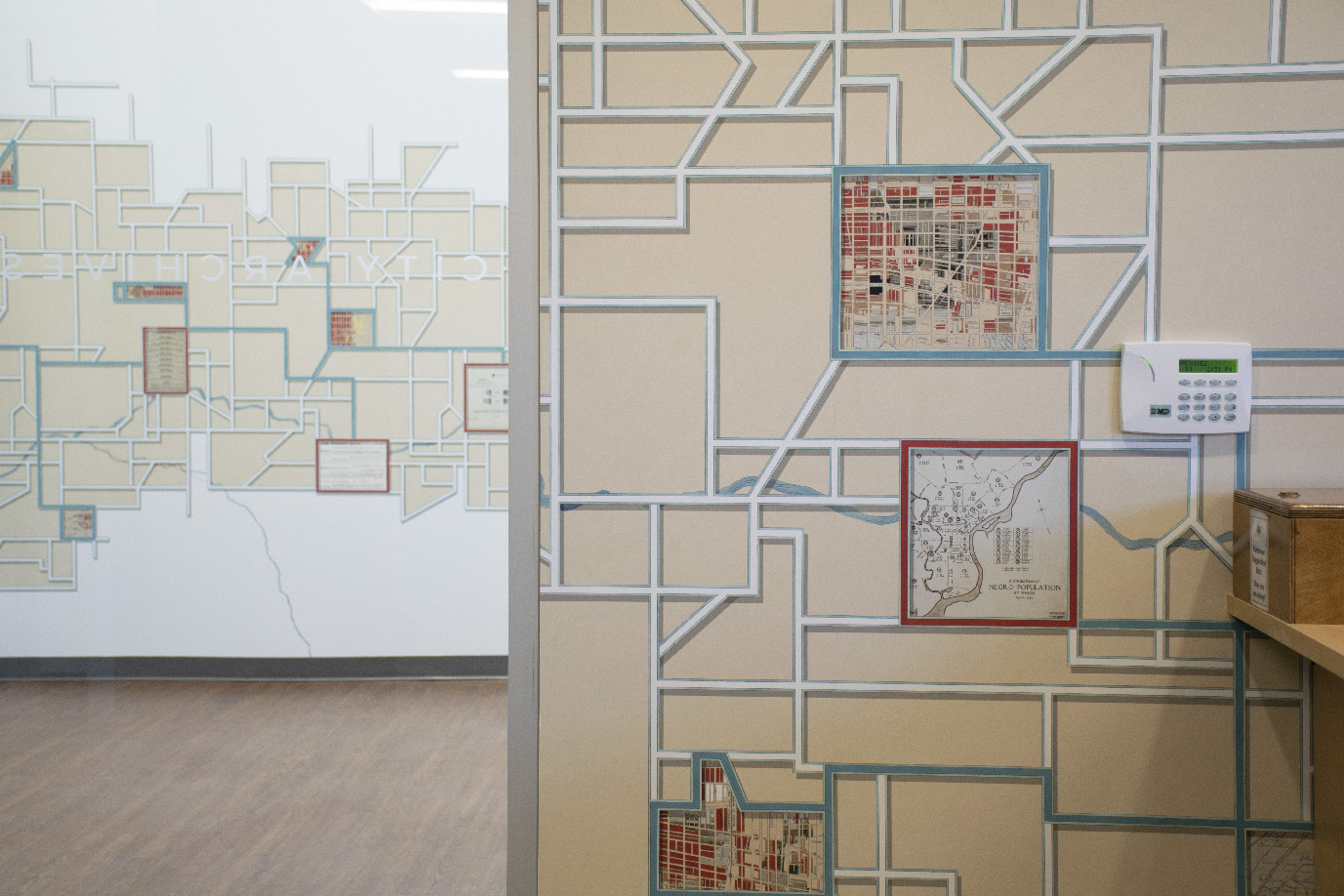
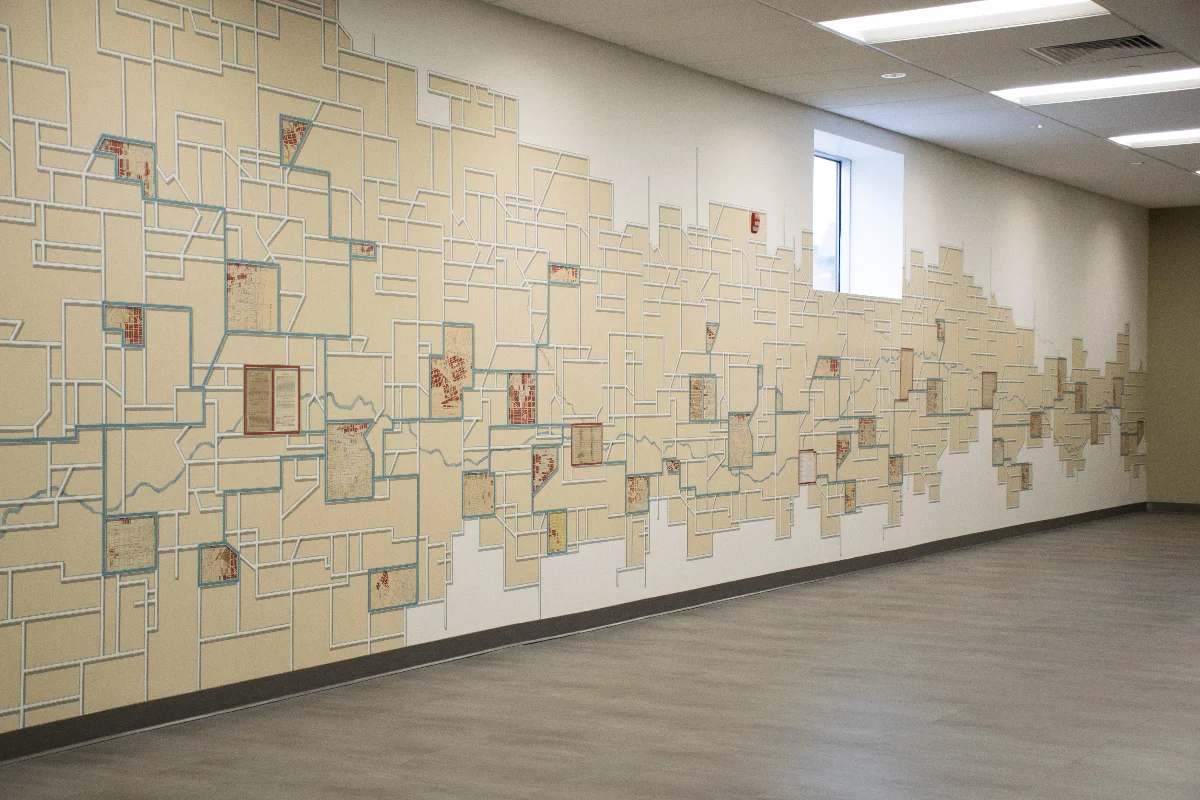
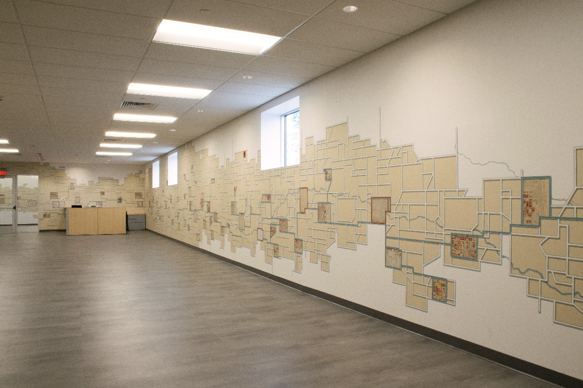
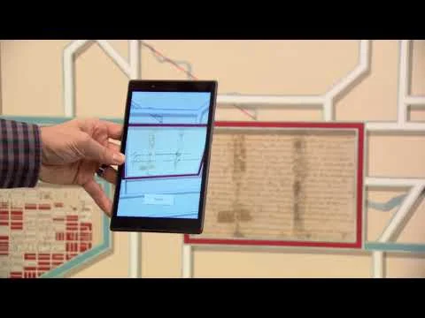
This site-specific interactive mural exposes the racism and discrimination of our collective past, and celebrates the acts of resistance that countered it. Using documents from the City Archives collection to highlight this history, the artwork’s narrative focuses specifically on abolitionism and housing discrimination in Philadelphia.
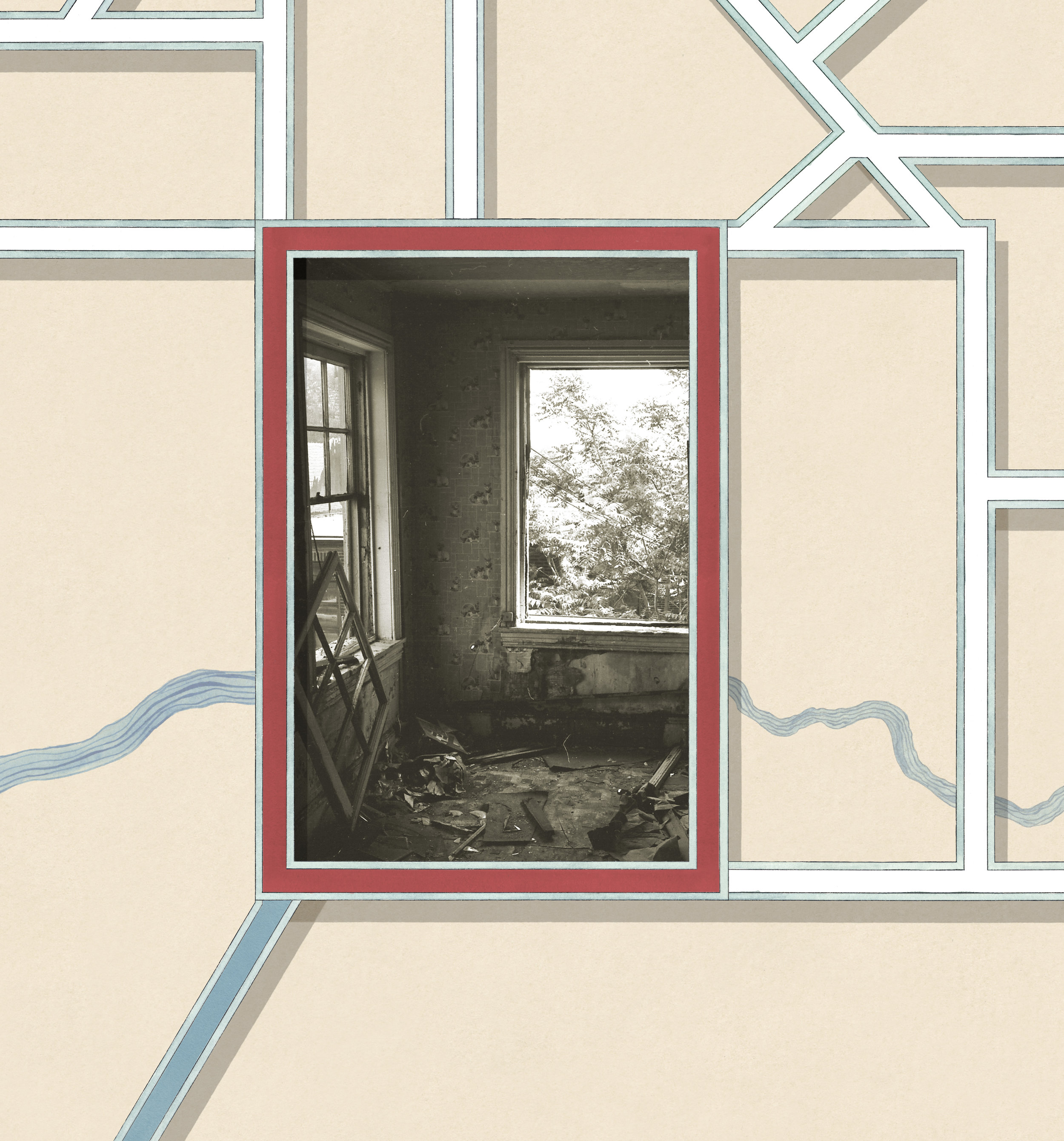
The design of the mural takes inspiration from the historic maps in the Archives which chart the development of Philadelphia’s streets, and the conversion of the natural waterways to sewers. The most prominent network of lines alludes to the city’s street grid, and establishes a framework for the display of other documents from the collection.
The primary Archives document displayed in the mural, a redlining map of Philadelphia, was created by a private company and shared with the city in 1944. Starting in the 1930s, surveys such as these were created to compile information on the racial make-up of city neighborhoods throughout the country. The findings were then used to deny African Americans access to funds for purchasing and maintaining homes and businesses.
Each section of the map displayed on the mural highlights a location relevant to the story of resistance. As viewers walk along the mural, they will notice sections of the map cut out, revealing archival documents relating to important people, events or organizations from this history. The fully exposed documents, highlighted with a red outline, become gateways to more information, revealed through the use of an interactive app.
Scanning documents at the beginning of the piece will allow viewers to read and hear stories of housing discrimination through the 1960s, with an introduction contextualizing this history in the present day. As viewers move through the foyer and into the reading room, they will move back in time, with stories of resistance to housing discrimination making way for stories of resistance to slavery.
Untangling the Fox and the Grapes, 2018
Site Specific Installation at Ebenezer Maxwell Mansion, Philadelphia
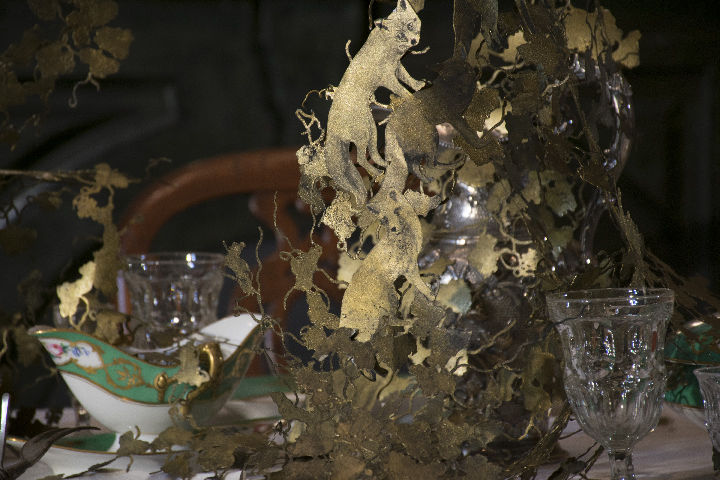
The site-specific piece for Victoriana Reimagined, Untangling the Fox and the Grapes, takes inspiration from Maxwell Mansion’s “Fox and Grapes” gasolier by Cornelius and Company. In the Aesop’s fable depicted in the gasolier, a fox tries to reach a cluster of grapes hanging on a vine. When he is unable to reach them, he consoles himself with the belief that they are probably sour. The moral, that a wise person does not strive for what he cannot attain, seems to support the maintenance of social hierarchies.
Untangling the Fox and the Grapes explores the complex range of possible readings of the fable, simultaneously focusing on and subverting the emphasis on keeping people in their place. In the piece, cut paper grape leaves appear to grow from the chandelier and onto the table. Betwixt the leaves, foxes climb over each other to reach the grapes, yet ultimately become ensnared by the vines. Their ascent is both sequential and cyclical as they climb, reach for the grapes, become ensnared, and climb again. Fox calls from the wild mingle with tinkling cutlery and sounds from around a dinner table, drawing further connections between the fable and this very human experience.
I collaborated with artist Jordan Deal on the sound for this project.
Threadbare and Tarnished: Tales from a Gilded Age, 2017
Site Specific Installation at Glen Foerd Historic Mansion, Philadelphia
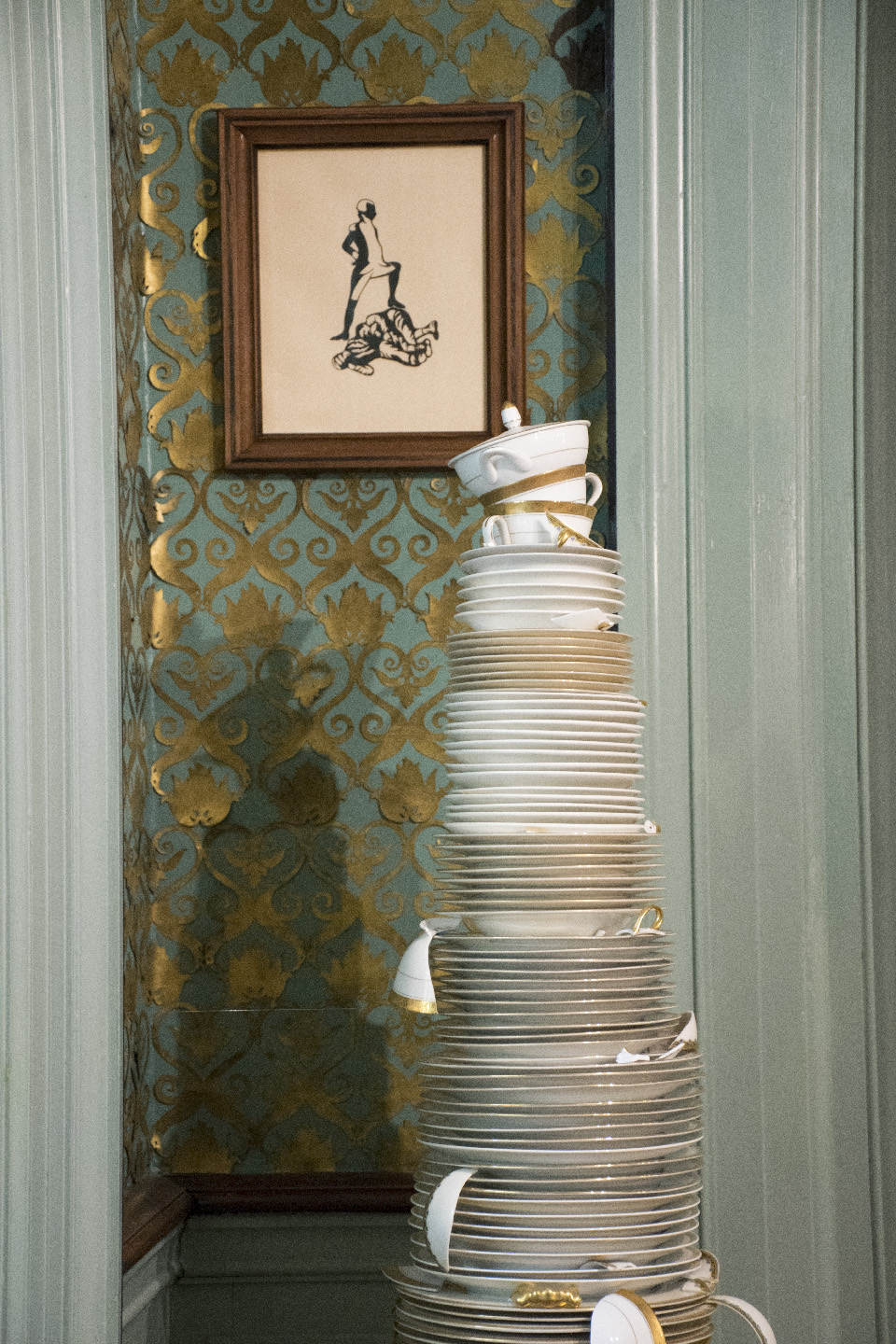
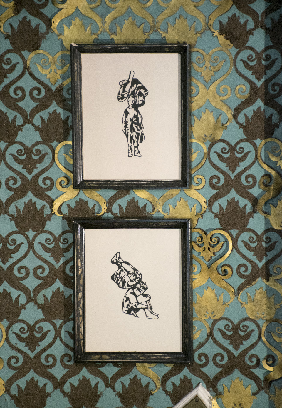
This site specific installation delves into themes of class and gentility, as well as accumulation and deterioration, to explore the history and legacy of the Gilded Age. The piece takes inspiration from the contrasting elements of Glen Foerd: its Gilded Age motifs and opulent objects, combined with the evidence of hoarding and deterioration revealed behind the scenes. The central element of the installation is a gilded wallpaper pattern which peels off to reveal a texture of mud beneath, suggesting alternate views of the house over time.
The gold veneer of the wallpaper pattern references the title of the novel “The Gilded Age, A Tale of Today” coined by Mark Twain and Charlles Dudley Warner. The phrase ironically highlighted the thin layer of gold which concealed the persistent problems of poverty, inequality, and corruption of the era.
Adorning the wallpaper is a series of framed cut paper pieces combining references to the painted silhouettes in the Mansion with images of poverty from the Gilded Age. As the deterioration and entropy of the wallpaper increases, so does the absurdity of the poses in the cut paper pieces. The children in the images are forced into ever more impossible poses, carrying each other’s burdens and piling atop one another, while being ignored or actively suppressed by the genteel silhouettes.
The themes of accumulation (or hoarding) and deterioration are echoed in two sculptural vignettes. An awkwardly balanced chair seems to sink into the floor, while equally precarious stacks of china from the Mansion’s collection provide a towering counterpoint.
Passage, 2015-2016
Site Specific installation at Morris-Jumel Mansion, New York City
Located at the top of Manhattan in Washington Heights, the Morris-Jumel Mansion was surrounded by forest, marshes, and farmland when it was built in 1765. The majority of the population of Manhattan resided in the small corner at the bottom of the island. By 1865, when the last resident Eliza Jumel died, the city grid had traveled up Manhattan and reached the house, and the neighborhood was undergoing urbanization.
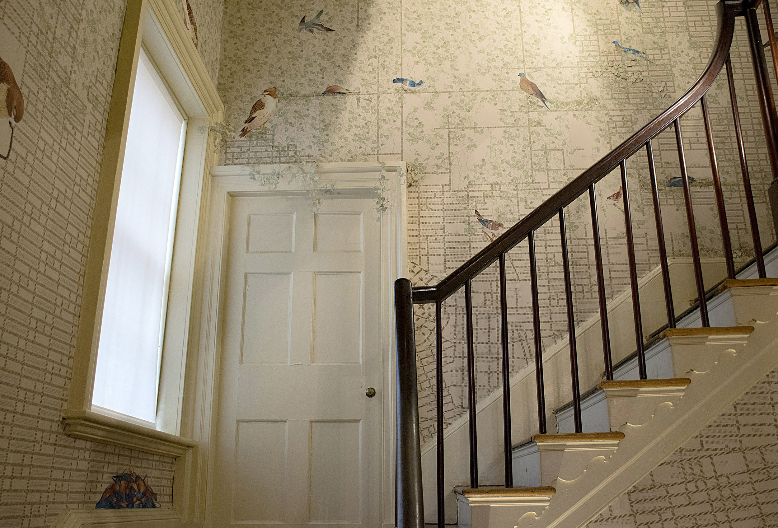
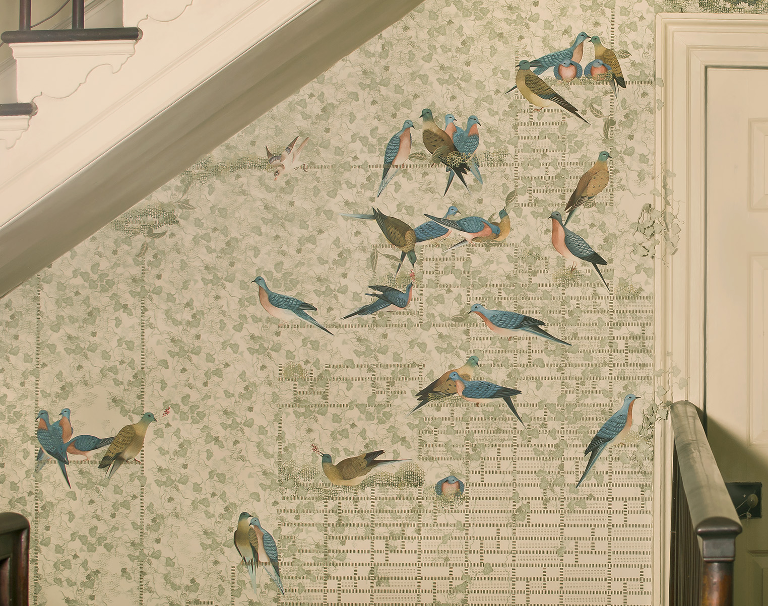
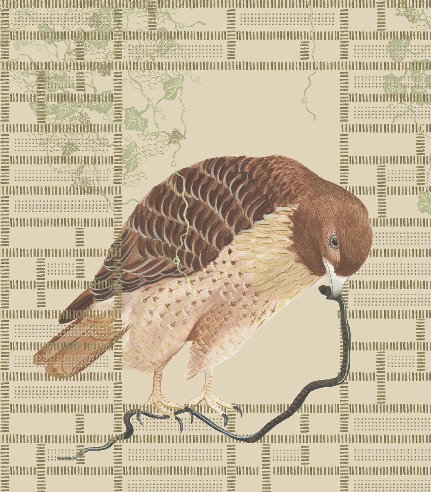
In the site-specific installation, Passage, the transformation of this landscape is explored through the juxtaposition of a grid-based design with flora and fauna that existed in the area before it was urbanized. The installation appropriates the motifs in historic and existing wallpaper and carpets from the home, as well as period styles, to describe the changes in the landscape surrounding the house over time.
The installation consists of two related pieces, a mural in the main stairway, and a floor-based installation in Aaron Burr’s bedroom on the second floor of the house. In the mural, a motif from the hallway wallpaper on the first floor is transformed into a design referencing the growing city grid in Manhattan in 1832, the era of the Aaron Burr Room. As the viewer moves up to the second floor, the mural reflects a progression back in time, with the grid dissipating and the natural motifs dominating.
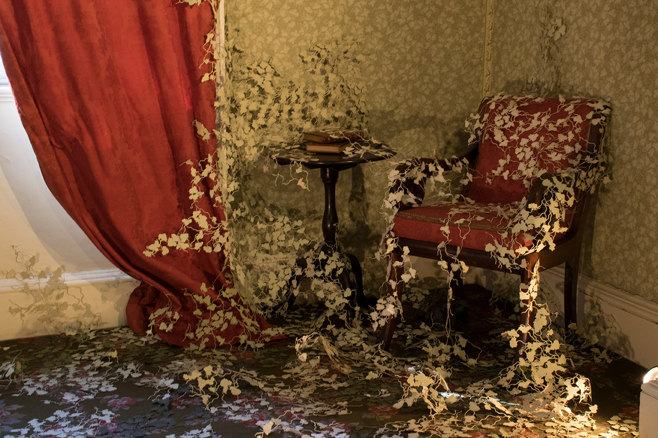
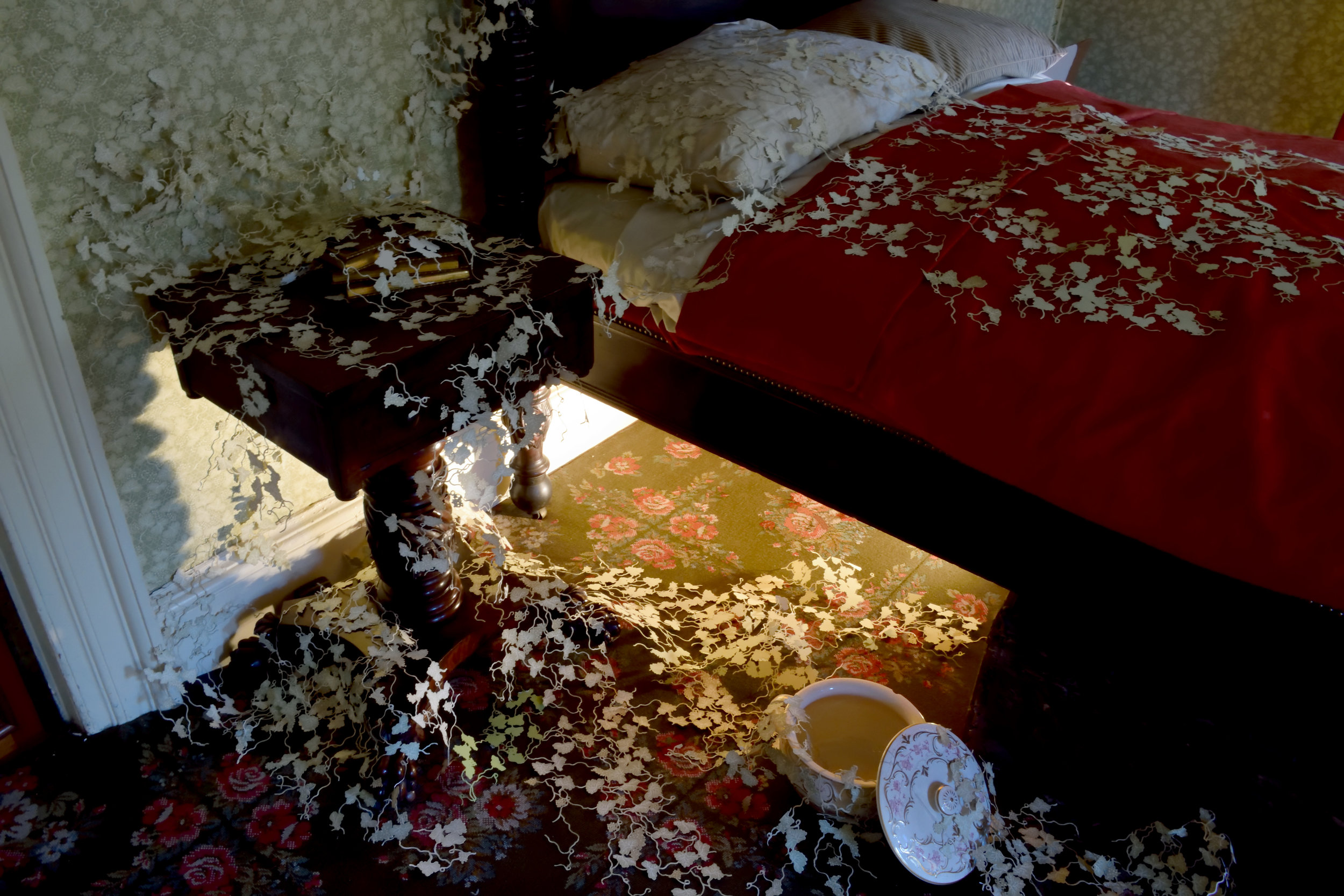
The piece in Aaron Burr’s bedroom transports the viewer to 1832, portraying a wild, garden-like space suggestive of the area of upper Manhattan during the time that it was inhabited. The piece also uses existing motifs, this time solely from the room itself, including the grape leaves in the wallpaper, and the rose motifs in the carpet. The grape leaves appear to grow off of the lattice pattern in the wallpaper, covering the furniture, weaving among the roses of the carpet, while erasing suggestions of the grid from the design.

